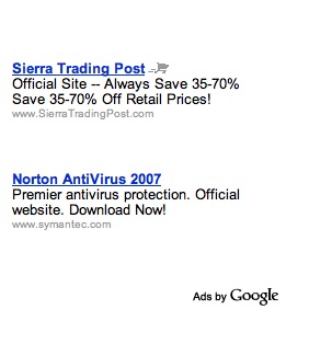
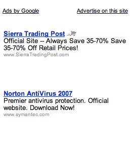
Ok, I’ve seen this in about 4 different situations now, all here on this blog. Look at the two adsense blocks below. They both came from this post about Namecheap coupons for April 2007.

Notice the placement of the “Ads by Google” on the left ad. Also notice the lack of color. I don’t think the placement will matter much, but the lack of color will definitely help the ads blend into the layout of the page. For most of my sites, that is most important.
What do you think about these two different ads?


The one on the left is more attractive, the placement of the Google Ad link and the lack of “Advertise on this site” (which is better in a separate ad space)
With the “google bit” at the top thy will pull more advertisers but with it at the bottom the will “sell” more clicks. I’d expect to see the ballence testing time and again as the need shifts between fresh customers and fresh clicks.
I am pleased to see the text moved, and particularly “advertise on this site”. I’ve long wondered about whether I should turn off that feature, given how the link presents a visual barrier when presented in that location.
They are testing a wide variety of different ads right now. I’ve seen some very web 2.0 looking ads as well.
I’d like to see how they effect CTR..
I’ve been noticing the same thing. Google seems to be throwing a lot of different things up there for my AdSense ads on my sites. I’m adding your blog to my blog about blogs (?) today. I find it very informative, particular the post about the 66 ways to get links in 2007.